Platformability is now optimised for Portable Devices.
(Give it a go on your mobile!)
How to achieve a better User Experience on Portable Devices…
As much as everyone loves big pictures for blog backgrounds or lots of fancy widgets or flash animations, these tend to not be appropriate on Portable Devices (the ones i’m thinking of are; iPhone, iPad, Android or BlackBerry). These features which are quite neat on a desktop computer can quickly become irritating on small screens. Yes, we can zoom in & out but that just slows us down as we wait for the page to increase in size, and then have to scroll left and right to read sentences that are too long to fit onto the screen. This means that often we are just waiting for the page to load. Even on a 3G network this can be boring.
What can be done?
As usual, there are a number of solutions. Here are my favourite two:
Optimise your existing site to be more fluid and adapt to users’ resolution
Create an alternative theme for Portable Devices.
We have opted to go for the latter (2). Optimising your existing site to work better on mobiles can be frustrating as you feel that you are cutting out functionality just to be able to appease the lowest common denominator.
Other pitfalls include super-compressing your images to have a better load time on mobile networks, stripping out any flash bits you may have to keep Steve Jobs happy, (I’m joking of course, let’s not get into that debate again) removing drop-downs or any interaction that works on hover. This can be painful and often leaves everyone unhappy as lots of “nice things” have been left out.
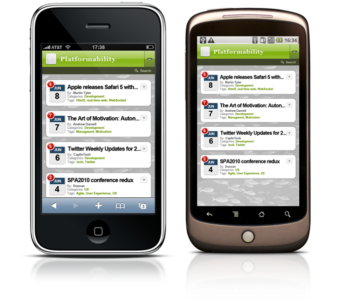
Having an alternate theme for Mobile Users can be very effective in increasing the number of eyeballs on your blog. By creating an experience which is relevant to it’s environment (for example someone standing in the train just wants to quickly scan headlines and get the “gist of it” and not spend time waiting for pages to load on an already flaky connection because of tunnels etc.) you can greatly increase traffic. An other upshot of this approach is you do not feel the site has been compromised as the “full experience” is still available.
Implementation
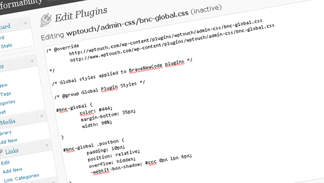
A great way to achieve this is a plugin called WpTouch. This plugin can really help to improve your loading times on mobile networks.
Customising
With WpTouch’s options a bit of CSS-ing and designing your own assets you can customise this plugin, bringing it in line with your existing branding and “desktop theme” and make it work for your needs. It’s very quick to implement will make a world of difference to users browsing your posts on their phones by increasing readability, adding intuitive touch control and keeping important functions such as search, comments & contact forms.
So why don’t you go check out this post on your mobile?