Welcome back to this series on the psychology of UX!
Today’s lesson is:
People don’t want to think or work more than they have to
Firstly, I don’t think many people are going to debate this point if they are really honest with themselves. I’m not arguing that we can’t all have bursts of motivation and be hard-workers, but *ultimately* we are all lazy (or ‘efficient’ as Susan puts it).
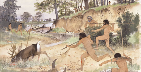
And there’s a very good reason for that. Throughout our evolution, we’ve managed to survive longer if we successfully conserved our energy. This means that we would focus on exerting the least amount of energy possible to attain our core needs (water, food, sex, shelter and protection against danger/threat) as we couldn’t be certain where our next meal was coming from and if we’d have a calorie shortage.

Today that’s clearly not the situation with food in every corner shop, but the behaviour is still ingrained in our genes and we can’t shake it off easily. If we take the example of hard-workers who may contest that they are not lazy, the fundamental reason for their effort to climb up the career ladder is money which equates to being able to purchase our core needs (water, food, sex, shelter and protection against danger), so perhaps being a career-person is the laziest choice for attaining those essentials (rather than say building a house for yourself, digging a well to get water or hunting a caribou for hours).
So now that we’ve established the idea that people are all ultimately lazy…
Let’s explore some examples of how some people are lazy on the web
Susan references Steve Krug’s book, Don’t Make Me Think, where he states that ‘people typically glance at websites and scan the content, clicking whatever they first see that catches their interest or vaguely resembles what they are looking for, rather than reading the whole page.’
Absolutely. You know it! I’m sure you’ve been to a badly designed website before where you get to it, there is a plethora of text bombarding your eyes, you get overwhelmed and quickly scan for a word that relates to what you are looking for and starting clicking away. A few clicks forward, a few clicks back and you are horribly lost. You leave the website. This approach happens with not-so-badly designed websites as well though hopefully you will find the content you are looking for on these in a short amount of time.
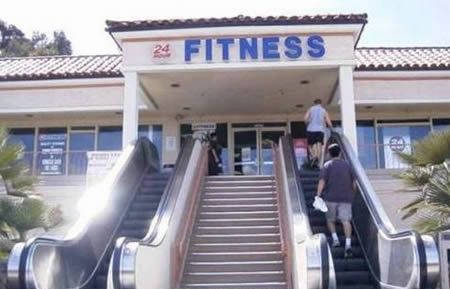
People like short cuts (a faster way of doing something).
Particularly if they have to do the task over and over. This is just another way to conserve energy through using your mind to find a lazy-friendly approach. However, interestingly, Susan points out that if it takes too long or too much effort for you to discover the short cut, people will default to the tedious, lengthy approach. In other words, we can be lazy about finding a solution that will allow us to be even more lazy. Ha!
A few web examples of short cuts might be when you are filling in a form, you might copy and paste data (such as your email), or have auto-complete fill it in for you. Similarly rather than remembering all of your passwords you may use a password-storage system in your browser that also auto-saves your passwords for you. However if initiating these services is too confusing to find, you may just take the extra time to type out your email address twice in a row or rattle off 5 passwords before you find the right one.
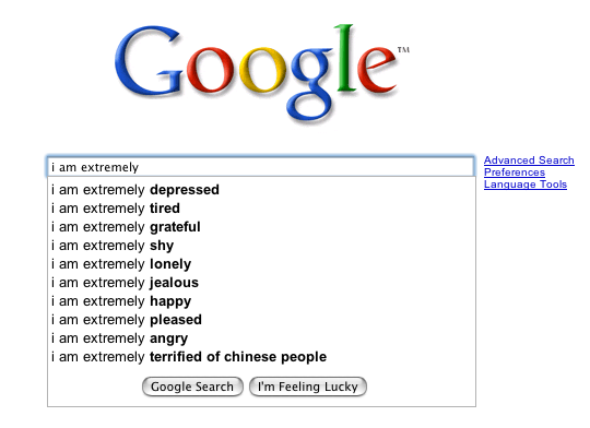
In the same vein, the term ‘satisficing’ was coined by Herbert Simon that combines the words ‘satisfy’ and ‘suffice’.
The formal definition for ‘satisficing’ is a decision-making strategy that attempts to meet criteria for adequacy, rather than to identify an optimal solution. As we do not possess the cognitive ability to weigh all the options, we settle for what is good enough rather than waste the energy trying to identify the best solution.
A web example of this could be when you are searching on Google — rather than go through the extensive pagination to find the *perfect* answer to your query, you are likely to settle for some item on the first three or four pages.
So those are a few examples of people’s laziness factor, but…
How can we consider this when designing the UX of websites?

Simple: allow people to do as little as they have to (including thought) to achieve the desired outcome on your website.
For instance you could:
- Make your website more scannable by using less text and adding more imagery (as humans are 90% visual creatures).
- Bouncing off the point above, show examples or explanations through imagery rather than text.
- Create clear & visible navigation with wording that is familiar (i.e., don’t be overly imaginative with your wording as it can confuse people who are used to web standards like ‘home’ and ‘contact’. But that also doesn’t mean you should talk like you are a computer in crazy code “Error 3.106 is faulty because of PHP.zipfile corruption 27695…” You get the point.
- Provide defaults and short cuts that cater to common work flows. For example, if you are creating a email website, make the buttons/access to the area where you ‘compose’ an email or ‘read’ emails dominant over other less important tasks.
- Make things that are clickable, look clickable and things that aren’t, not. For instance, make links have underlines or different states when hovered over.
- Don’t overcrowd your website with content. Give people a little bit of information and then offer the opportunity to learn more through subsequent clicks.
- And most importantly, find out your users’ true needs so you don’t overcrowd the website with unnecessary functions, content and clutter. Design for their desired needs and work flows only!
Hope you have enjoyed this post and it will highlight further the connection between human psychology and web design and the absolute necessity for designers (and developers) to consider the person in front of the screen. In the next part to this series I’ll be covering how ‘people have limitations’. Look out for it soon!
Always great to have more of this stuff; so many people still don’t accept these valuable principles about humans. Good shout on Arrested Development as well!