
A few weeks ago, two members of our UX team (Rafael and myself) had the privilege of attending the Web Directions @Media 2011 conference for two days of talks on all things web. The range of speakers who drew in ideas from tangent subjects, like history, product design and even gaming, gave us fresh ideas to contemplate in regards to UX. This is a summary of some of those insights.
Brian Suda – Visualising Data
One talk that was particularly applicable to the sort of data-driven work we do at Caplin was on the art of visualising graphs and charts. Brian Suda covered the basic styles of charts common today from pie charts to bar charts to line graphs and then moved onto more graphical expressions of charts. His underlying message was that in order to quickly grasp the content behind a chart, we need to strip away the other visual distractions, such as unnecessary lines, words/measurements, shading, imagery, etc.
As an example of this, he referred to Edward Tufte’s Data-Ink Ratio when creating charts that don’t obscure the information. The Data-Ink Ratio refers to the amount of ink that is used for the actual data (non-redundant info) compared to the total amount of ink used in the entire graphic. What he was suggesting was that a graph that is useful should only have the non-redundant info, and get rid of all other ink usage. Below is an example of how this can be achieved:

Mr. Suda also mentioned that while visually stunning, 3D graphs proved to be more problematic than beneficial as the third perspective distorted information and hid information behind foreground objects.
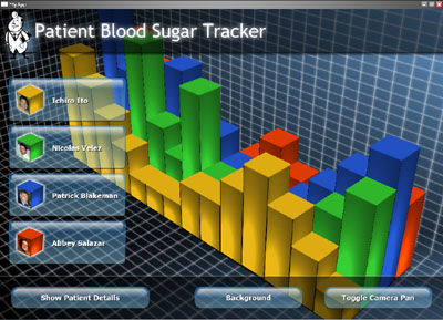
Similarly too much “chart junk”, as Suda put it, crowds the information and distracts, as can be seen in this example where the data is paired with an image to reinforce the information behind the data:

The take away message was that we should let the data speak for itself rather than clogging up the information with unnecessary text, lines and graphics. Perhaps the beauty is in the simplicity.
Tom Coates – A New Network
One talk that really spoke to me, coming from a product design background, was the introduction speech which focused on the whole environment around any given experience. We don’t live in isolated bubbles so we shouldn’t design in a bubble. Physical objects and digital interfaces should communicate across time and space to benefit our lives. One example of this was a guy who hacked his clothes washer so that it sent him notifications when it was done washing, when it was using energy, how much, and when it needed to be fixed. While this particular example may not be the best application of object-interface communication, it’s a step in the right direction to considering our complete environment and keeping products and services loosely joined. In industry terms this is often called ‘service design’.
One other cool concept that was shown was an interactive window display where round faced characters pulled colours from real objects, such as a man’s shirt, and became those colours. They then created colourful patterns out of all the colours they had collected that day. Bringing that level of fun into interaction design sounds promising and like a natural evolution.
(Watch the video here. It’s the bottom video. Skip to 3:13)
So how can we consider service design when designing financial applications? By being aware of the lifestyle of the people using these applications. Can we combine usage of mobile phones, desktops computers and tablets more so that our users aren’t chained to their desks? How can we, considering their circumstances, free them and benefit their lives?
Hannah Donovan – Designing without the Browser
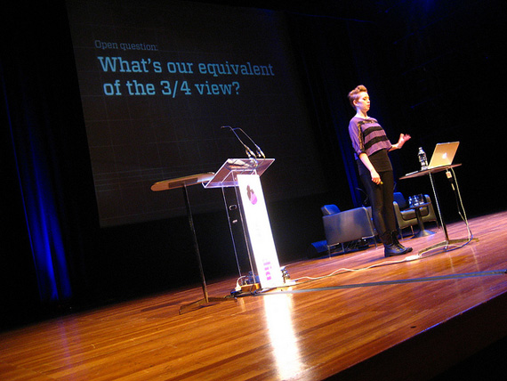
One of the issues User Experience Designers encounter is creating designs that communicate for themselves. Often clients get confused about the flatness and skeletal-element of wireframes, or are confused about how things would interact in reality, and often understandably so. Essentially what you are looking at is a flattened, bare bones version of a web design; a snapshot of one moment on that webpage without the fluidity or context for interaction. When Hannah Donovan gave her talk on this very problem, she posed the question “What is the ¾ view of UX design?”.
If we look at architecture, concepts of buildings come to life when we put people into the picture, or we animate movement throughout them in 3D models. If we look at product design, we can have 3D models that rotate to show all angles, textures, colours and give people an idea of form, shape and semiotics. With cartoons, we can create complex characters who have personalities, different poses and expressions.
With UX Design, we are often limited by the 2D, especially if we don’t want to waste the time to develop functional coded sites in the concept stage. So then we must consider, how can we breathe life into our web designs and wire frames so others can interpret them easily? If I were to scratch the surface at answering this, I’d probably lean towards having more interactive prototypes that guide the user through specific workflows, teamed with painting a more complete picture of the world of the users who will be using the design. For instance, when do they access your site or app? Why? What are the circumstances around them? How does this app/site interact with other technology or sites? How can it be simpler according to their lifestyle?
Overall, WebDirections was a fantastically refreshing event that posed new questions to us that we will seek to consider in our design process. Hopefully we’ll see you at WebDirections next year!
Glad to hear you had a good time Vanessa – thanks for the write up!