FX Tiles provide two main pieces of functionality, the ability to see live rates for a certain Currency Pair Volume Bands and the ability to Trade quickly.
It is this first piece of functionality that most users will be using most often, setting a large volume in their FX Tiles, so that they can see the rate they will receive when they trade in size. But this creates a big risk, the risk of fat finger errors.
Caplin’s default FX Tile requires just a single mouse click to execute a trade, which creates a potential risk for users who are not careful. It is easy enough for anyone to accidentally click on a Tile and execute a large trade erroneously.
Of course, we have for years had an alternative solution, a 2-click trade option, which allows the user to click once to active “trade mode”, and then either confirm or cancel their trade by clicking a separate button.
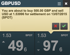
This system is functional, but it creates an extra unnecessary step for users. They must first click the Buy or Sell button, and must then move their cursor to the “Confirm” button to perform the trade.
While some users like this extra security, many others prefer the instant feedback that they get from one click trading, as it allows them to be more accurate with the price that they can achieve. We wanted to find a solution that provided both instant feedback, while still avoiding Fat Finger errors.
The most obvious way to do this is change trading from a single click to trade, to double click to trade. But this comes with its own set of UX concerns.
Requirements
There are a certain minimum set of requirements that would be required for Double Click Trading
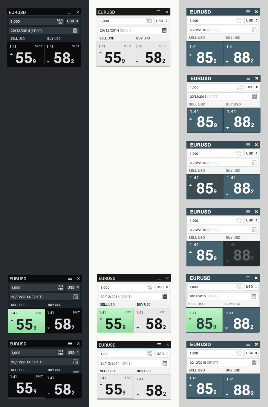
- Active State: The user needs to be informed after their first click, that their next click will make a trade.
- Maximum click time: The user must click twice within a certain time for the trade to be executed. If they exceed this time, they should be notified.
The maximum click time is simple enough to solve, after some experiments, we found that 300ms is a good amount of time to create an active state. It is short enough to feel like two connected actions, but it is long enough to let you quickly confirm that you are trading correctly. This interaction time will be configurable.
The Active state is much more complex. Simply binding a button to a Double Click action is a big User Experience error. Users have been trained to know that a button is a “Single Click” component, in the same way that we know that a “Folder” on our desktop is a “Double Click” component. For a user to click a button and get no response, is a very unpleasant experience. While the user will inevitably then try to Double Click the button, they have already lost confidence in what behaviour to expect.
Iterations
So how best to help them discover the behaviour of the system?
We went through a lot of iterations to try and find the perfect design for the “Active State” of our Double Click functionality, so that the user would be able to intuit that an additional click will make the trade.
There were several critical things we had to consider.
Light and Dark themes
Caplin FX Professional is designed to be easy to theme, with both Light and Dark themes being popular with our customers. It was important that any design that we created would work well with both light and dark themes. Early iterations had the “Active” state signified by a “highlight”. While this works nicely on a dark theme, it doesn’t provide enough contrast on light themes. We experimented with having a “lowlight” on dark themes, but darkening a button to signify that it is “Active” turned out to not be very intuitive
Keep focus on the area which is important
We considered that rather than highlighting the main button, we could instead darken either the opposite Trade Button or the entire Tile, so that the user could instead focus entirely on the side they were about to trade on. However, darkening the opposite trade button had the opposite effect as we expected, as we realised it takes the user attention’s away form their intended action.
Darkening the entire Tile on the other hand is more intuitive, but becomes somewhat unwieldy when considered in the context of your application as a whole, because the Tile that you are focused on becomes dark while all your other tiles continue on as normal. This turned out to be less than ideal experience, and is a good reminder of how important it is to consider how an individual element fits in with the rest of our application.
Large color changes
FX Professional themes typically have an accent color, to highlight interesting user interaction events. While we experimented with this for the Active State, ultimately it didn’t seem to fit very well. It is a very large color change, which looks odd when a user is double clicking to trade, and felt slightly alarming.
Solution
Ultimately, we decided that the best solution, would be to “lift” the button by raising the content and adding a dropshadow.
This solution combines all the positives of other solutions while limiting the negatives. It gives the user an indication that they have entered an active state, without taking their focus off of the rate or interfering too much. It creates a satisfying “kinetic” feel, where the button feels 3-dimensional and is satisfying to click.
Of course, FX Professional is designed from the ground up to be customisable, making it is simple for any of our customer to explore other solutions. As we continue to iterate, we are confident that we have provided the best possible out-of-the-box solution to Double Click Trading.