Last week I attended a talk at Skills Matter by Adobe Technical Evangelist Christophe Coenraets in which he gave us a whirlwind tour of some of the new features available in the latest version of Flex and its ecosystem. There is a video of the event on the website but if you don’t have 90 minutes to spare then here is the first of a two part recap. There was plenty of interesting stuff for developers and UX designers – in this first part I will cover data service introspection, new state syntax, new transition syntax and skinning with the new UI control model. Part two will focus on trading, LiveCycle Data Services, LiveCycle Collaboration Services, Catalyst and Mosaic.
Flash Builder 4: Improved interaction with data services
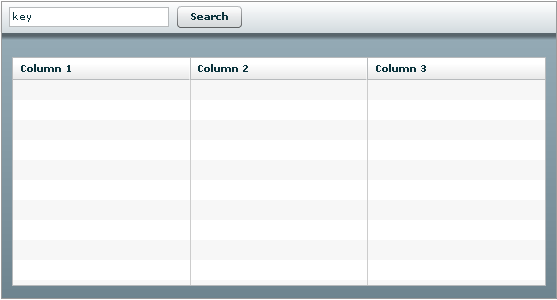
Christophe began by building a Twitter search application in order to showcase the improved way to communicate with data services in Flash Builder 4. Throughout the talk he did almost everything in the design view rather than writing any code, so to create the UI he just dragged in a control bar with a text area called key and search button, and a data grid to display results. It looked something like this:
To perform a search we would use the Twitter API, for example http://search.twitter.com/search.atom?q=flex4 to search for “flex4”. The problem is that in Flex Builder 3 interacting with an HTTP service like this is very dynamic – you can create a WebService object but it cannot give you any code completion options and it will not fail to compile if you try to invoke an operation that doesn’t exist.
Flash Builder 4 includes a “Connect to data service” wizard that allows various types of data service to be configured, including HTTP and LiveCycle Data Services. In the HTTP wizard it was possible to paste in the base URL and then define a list of operations – in this case just search.atom – and a list of parameters for each operation, in this case q. This generates a service proxy object that you can give a custom name, for example TwitterService, and the proxy object is populated with methods for each of the operations you defined. Our proxy object included the method TwitterService.search(String q).
The wizard also allows you to customise the return type using data service introspection. What this does is execute the operation and show you the returned XML as a tree. Christophe pointed out that the XML typically contains some boilerplate information at the top which is not important, the relevant part of a twitter search is the list of <entry> elements which represent tweets:
<entry>
<id>tag:search.twitter.com,2005:12256129876</id>
<published>2010-04-16T01:23:52Z</published>
<title>getting #vs2010 iso takes a while. Oh, well, I'll play
with #Flex4 while I wait for .net and #SL4 downloads. It's good
to have options</title>
<updated>2010-04-16T01:23:52Z</updated>
<twitter:lang>en</twitter:lang>
<author>
  <name>TarasNovak (TarasNovak)</name>
  <uri>http://twitter.com/TarasNovak</uri>
</author>
</entry>
You can select this list of <entry> elements in the XML tree and mark it as the return type of the search operation, filtering out all the other stuff. To add even more semantic meaning, you can rename “entry” to “Tweet” – the search method on our proxy object now returns an array of Tweet objects. If you want to access properties of the Tweet in your ActionScript (including nested elements) you use the normal dot notation:
var myTweet:Tweet;

// returns "2010-04-16T01:23:52Z"
var publishedDate:String = myTweet.published;

// returns "TarasNovak (TarasNovak)"
var authorName:String = myTweet.author.name;
Hooking everything up didn’t require any code to be written. You can now right click on a button and choose “generate service call” from the context menu, then select the TwitterService.search operation and bind q to {key.text}. Using the context menus you can also bind the data grid to the return value of the TwitterService.search operation – the data grid is automatically populated with a column for each of the attributes on a Tweet.
Summary:
- You can now define data services more easily using the new wizards.
- By giving Flash Builder more information about what your data service does you can interact with it in a strongly typed way.
- It is possible to build a working Twitter search app in about 10 minutes without writing any code.
Flex 4: Improved state syntax
The next example used a similar application, only this time it displayed employee information from an LCDS data service. It was possible to automatically generate a form from the data grid of employees using the context menu. The application looked a bit like this:
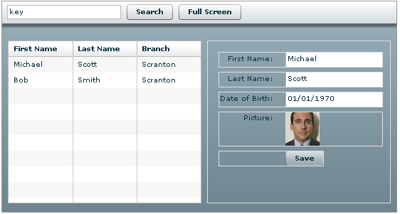
The goal was to make the “full screen” button remove the data grid so that the form fills all the available space. To do this, Christophe created a new state in the design view called fullScreen, deleted the data grid and adjusted the width of the form to 100%. He then switched to the generated MXML, which now has these states:
<mx:states>
    <mx:State name="state1" />
    <mx:State name="fullScreen" />
</mx:states>
The key point is that states used to be unreadable because they contained so much information about how to transition into that state from the base state. Now the states themselves are kept simple and the differences are added to individual components in a “cleverer” way.
In the MXML view we saw that the data grid element now had an attribute includeIn=”state1″ because Flash Builder had worked out that it only appears in that state. The form element had an attribute left.fullScreen=”0″, indicating that when the application is in the fullScreen state it should take up the whole area. This attribute.state=value syntax is new in Flex 4.
Summary:
- After adjusting the application in design view, the generated MXML is much cleaner.
- There is a new syntax for defining how components behave in different states.
Flex 4: Improved transition syntax
In order to make the change between normal and full screen states a little more attractive we added transitions to the MXML. Note that the snippet below is pseudo-code based on my scribbled notes and the syntax may not be 100% accurate.
<mx:transitions>
    <mx:Transition toState="fullScreen">
        <Parallel>
            <Fade target="{dataGrid}" duration="1000" />
            <Resize target="{myForm}" duration="500" startDelay="1000" />
        </Parallel>
    </mx:Transition>
</mx:transitions>
This created a nice effect where data grid fades away and when it is fully removed the form smoothly expands to fill the gap. The startDelay attribute, which ensures that the form doesn’t start expanding until the data grid has finished fading away, is new in Flex 4.
Flex 4: Skinning
If you take a look at the code for an old “Halo” style component such as Button (which you can do, because as Christophe pointed out they are open source) you can see that the Button class defines both the behaviour and the look-and-feel of the control. This is a bad thing, because in order to change something like the graphics or layout of the control you would need to subclass the Button and edit the ActionScript. This style of control also does not work with Catalyst, which we covered later.
Flex 4 introduces a new component model called Spark which splits the behaviour away from the look and feel. Spark controls consist of an ActionScript behaviour class and an MXML skin file. According to Christophe we should be comfortable creating skins for our custom controls because we already know how to lay out a UI in MXML, and skins are no different. Ideally the skins will be created by a UX Designer in Catalyst and the code will be written in Flash Builder by a developer. Skins for a control can then be seamlessly swapped in and out by changing the new skinClass attribute for the control.
To demonstrate this we were shown a Webcam class that enabled the user to take a photo and replace the existing photo in the employee application. Initially the webcam just appeared as a box above the existing photo, but by changing the skinClass to a different skin and refreshing the page the webcam box slid out from behind the existing photo and included a shutter sound effect when the new photo was taken, which is defined in the skin.
Summary:
- Splitting the behaviour away from the UI makes sense, and supports the idea of dividing work between the developer and designer – this is really just the same concept we see in Silverlight where developers use Visual Studio and designers use Expression Blend.
- You can now change the look of the application without touching any code or affecting how it behaves.
Conclusion
We covered a lot more in the talk including improvements to LCDS, LiveCycle Collaboration Services, Catalyst and Mosaic. There was also a demo of a high-update low-latency financial trading application, which I was interested in for obvious reasons! All of this is covered in part two.