Caplin runs a biannual internal hack day competition for employees to work on fun projects and spike new ideas for future products. For this hack day our team comprised Lukmann Butt, Ed Pratt and myself. The aim of our project was two-fold:
The first part was around creating “One App to Rule Them All”, a long standing goal for our front-end architecture. At Caplin, we have several applications that target different kinds of users. These applications are comprised of various web technologies, and each has its own way of handling aspects such as menus and layouts. By creating a unified application that can be configured with different features depending on the person using it, we will enable more customisable workflows meaning fewer but more powerful applications for the end user, and simplifying application maintenance for us.
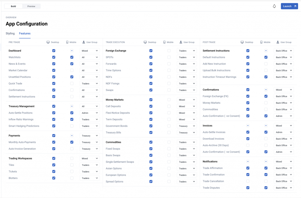
The new application allows us to open up a suite of powerful customisation options for our clients, which leads us to the second part of our project. We wanted to create an administrator interface with ability to enable and disable features in the main application, fine-tune features based on their configurable parameters, theme the application with our design system, override translations and provide new languages with an i18n editor, and more.
Ultimately, our vision was to create a “Caplin Demo” that could be available on our public website, allowing customers when they visit our webpage to build and play with their own Caplin Application.
In the end we achieved most of the aims we set out for the project, albeit in a very early prototype stage.

How We Built It
Building two brand new applications from scratch in a single day was an ambitious goal to say the least. Therefore, prior to the start of the hack day I had done a lot research into various libraries and technologies we could use to help us so we could get as much done as possible in the 24 hours available to code. Here is a break down of what we used to build the project.
Caplin CLI
Our CLI tool helps us generate new packages from a template, providing a lot of useful functionality for free. This includes:
- All of the tooling configuration for Typescript, Vite, testing, etc
- A skeleton application to begin building from
- A Docker image and Helm chart for deploying the application
- A Gitlab CI configuration file with jobs to build and deploy the application
Caplin Components
At Caplin we have a mature library of low-level components, like inputs and buttons, as well as domain specific controls such as calendar pickers with tenor controls. We and our clients can utilise these to create UIs in our design system nice and quickly.
We are also building up a stable of feature-level components that can be run in isolation, meaning they can be dropped into the application with a few props and “just work”. This includes features like FX Tiles, the FX Ticket and FX Orders. Because these features are so simple to integrate, users can easily turn them on and off and tweak them with the administrator interface, depending on their needs. In the future we plan to release these features as standalone packages so they can be added to existing applications and integrated with platforms like OpenFin.
Finally, we included a couple of recent dev-day projects I’d done using new charting and grid libraries, and we built a brand new “News” feature for our applications’ dashboard that provides a feed of the latest financial news from around the world.
Vite
Vite is my current favourite way of starting a single page React application. It builds really quickly and requires almost no confusing config. I had also considered using an SSR framework such as Next JS or Remix, however I felt the added complexity these frameworks bring both in terms of architecture and hosting is not worth it for the type of applications we provide, which are heavily focused on client side interactions.
React Router
React Router was used for page navigation, making it simple for us to set up client-side routing. It also allows us to achieve automatic code splitting between pages, improving initial load times.
Dockview
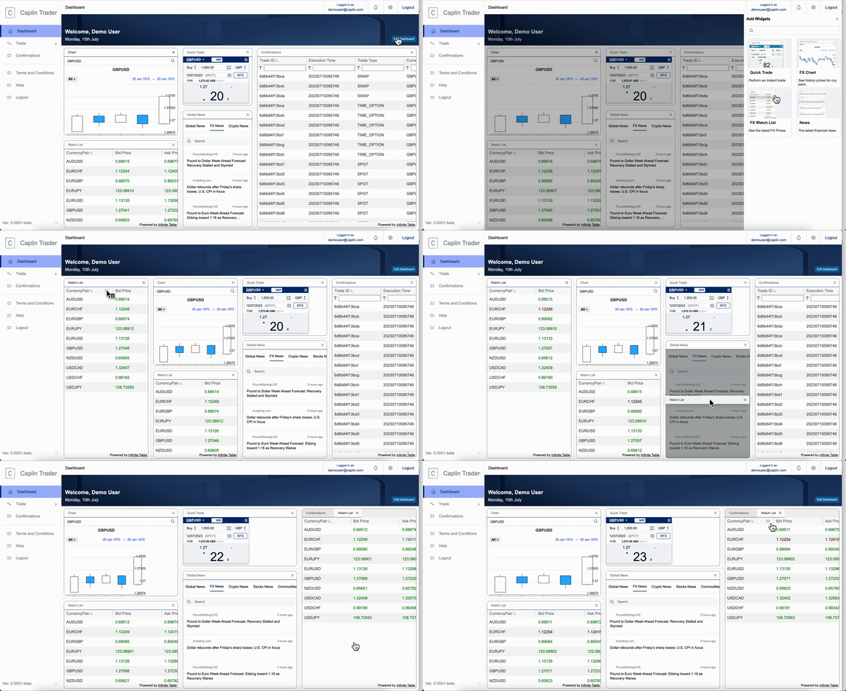
We used Dockview to build a customisable dashboard interface where users can add new widgets and move them around into various layout configurations. What I love about this package is that is has a really simple API and excellent documentation, meaning I was able to copy some example code and get something working really quickly. It was also very simple to implement layout persistence with the toJSON and fromJSON methods, allowing us to save the users layout to the browser’s local storage so it persists between page refreshes.
OpenAI
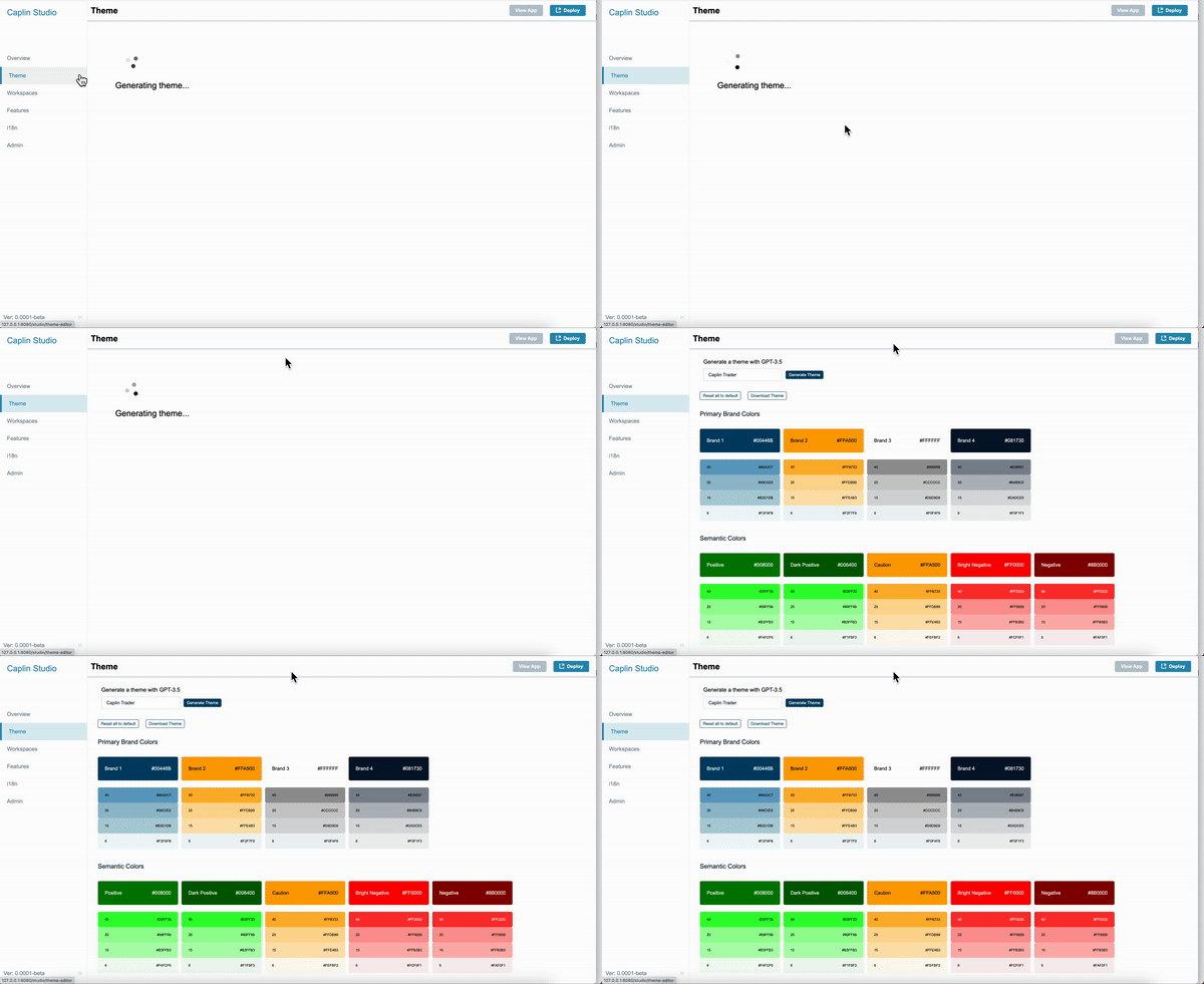
We used the Open AI API for generating a theme for the application based on the application’s name or a key phrase entered by the user. We used a lambda function with a HTTP endpoint for making the request. The request is effectively the same as asking Chat GPT to fill in some values for our design system tokens, based on the key phrase provided. This worked surprisingly well for generating usable themes in a matter of seconds, and it’s fun to see what comes out when you enter a creative key phrase!
AWS serverless services: API gateway, Lambda, Dynamo DB, S3
We used AWS for hosting the application config database and the images uploaded by users. There is a Lambda blueprint that provides a Node.js REST server that interacts with a DDB table, and automatically creates an HTTP API in API Gateway. This allowed us to get the backed up and running very easily and focus on building the application.
Challenges
The biggest challenge we encountered with the project was with cross-origin resource sharing (CORS). CORS is the more granular implementation of the strict ‘same-origin policy’: with limited exceptions, a web browser prohibits a web page from making HTTP requests to all servers except the web page’s origin server.
The first time we had a hiccup with CORS was in the news widget we built. CORS prevented our news widget from subscribing to RSS feeds from any server except the web app’s server. To solve this, we used the cors-anywhere package on the web app’s server to proxy the RSS feeds, allowing the news widget to subscribe to the RSS feeds via our server.
A much bigger problem however, was when our AWS backend stopped working and returned CORS errors. This took me hours to debug, and in the end it wasn’t actually a CORS problem at all. Instead, I was failing to include a necessary path parameter in the image requests to S3. The fact that this led to a CORS error was a major red herring that was very confusing as I had all the CORS settings enabled across the AWS stack. A 404 error would have been more helpful in identifying that the problem was with the URL!
Another challenge we faced was styling the application and trying to make it look as good as possible in the limited time we had. The designs Ed produced in Adobe XD were a huge help, as we could copy CSS directly from his project into the app, but even then we couldn’t do any sort of justice to his incredible vision. Below is a sneak peak of how a real version of the Admin interface could look.
Wrap Up
Fortunately, our demo ran smoothly and got a great reaction from the company. These ideas have huge potential benefits for our customers in terms of allowing greater and easier customisations of our apps, as well as internal benefits for us by streamlining application development. We are looking forward to doing more work on these concepts in the future and hopefully one day turning them into real products.

Really interesting article – respect to you for sticking with CORS issues, they’re never fun!