Hello Designers!
Tired of doing the same things again and again? Why not use my personal Lazy Kit, filled with useful time savers and ‘best practice’ principles. Give it a download and try it on your next website design mock-up.


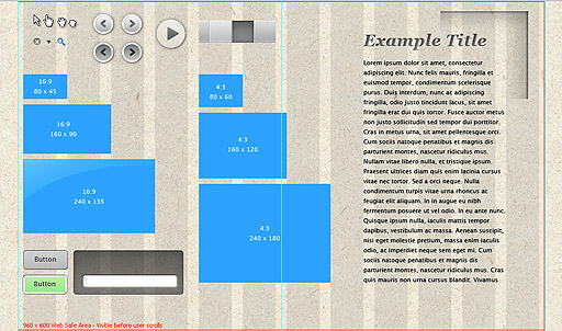
960 Grid system
All modern monitors support at least 1024 × 768 pixel resolution. 960 is divisible by 2, 3, 4, 5, 6, 8, 10, 12, 15, 16, 20, 24, 30, 32, 40, 48, 60, 64, 80, 96, 120, 160, 192, 240, 320 and 480. This makes it a highly flexible base number to work with.
Web Safe Area
960 x 600
This ‘safe area’ is based on a 1024 x 768 Resolution and applies to maximized browsers (in their standard UI configuration, e.g. no Google toolbar etc…)
The idea is that you want to fit your header, navigation, key messages, and a
recent piece of content into the safe area. This will maximise the impact of your page.
We all want users to spend a long time on our sites, but the reality is that people hit your page and do a quick visual scan to decide:
- What the page is about, is it relevant?
- Is this interesting enough to interact with anything?
- Should I leave immediately?
Your goal in using the safe area is to entice users to scroll and discover the rest of the page and content, click on your content, navigate through the site.
Mouse Cursors
Pointer, Finger, Grab & Grabbing
Spare Parts
Close Icon, Dropdown Arrow, Search Icon, Left and right Gallery Arrows,
Play Icon, Top Navigation States
Video Sizes
16:9 – 80×45, 160×90, 240×135
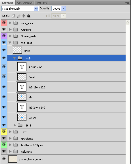
4:3 – 80×60, 160×120, 240×180
These are place holder boxes for video content that will work well within the 960 grid system
Gradients
Nice Multi-point soft Gradients with curved falloff
Button and Styles
A few Styles that I use all the time in my mock ups
Lorem Ipsum Text Box
Lorem Ipsum is simply dummy text of the printing and typesetting industry. Every Web Designer needs place-holder text boxes to be able to balance the weight of the page properly. Having the real copy would be even better but most of the time that luxury is not available, as the copy is still being written whilst the designer works out the look and feel.
Try and at least get a hold of realistic Titles and Headings (this can help a great deal in conceptual thinking and planning of page).
This text Box has about 5 paragraphs worth of text in it, just click on the text box with text tool to expand size of box and reveal more dummy text.
Enjoy & Feedback
Let us know how helpful this is to you, the more we hear from you, the more we can give you what you want for free!
