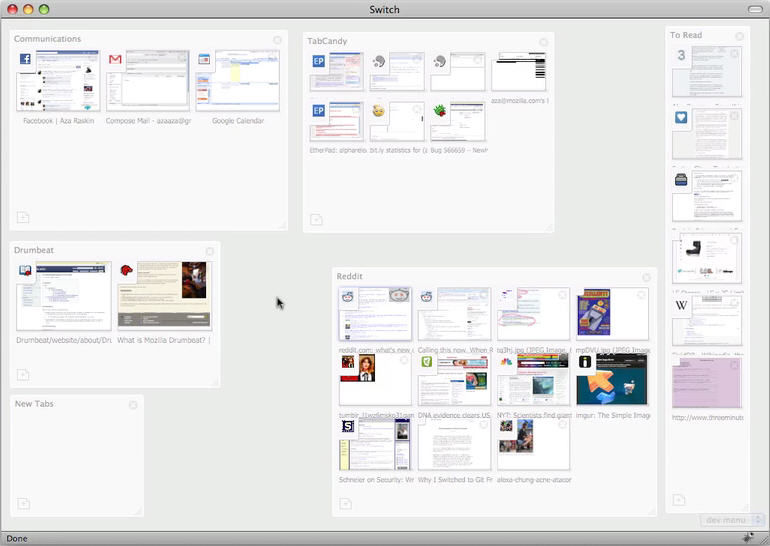
Does Tab Candy signal the slow death of the tab?
It’s a strange turn of phrase, but as we do more and more online keeping tabs on everything and segregating areas of interest is becoming a more and more frustrating and complicated task when using the tabs within a web browser.
We need a way to organize browsing, to see all of our tabs at once, and focus on the task at hand. In short, we need a way to get back control of our online lives.
 http://www.azarask.in/blog/post/tabcandy/
Tab Candy for Firefox shows another way with groups and spaces allowing you to take back control of your web browser’s tabstrip.

Grouping related tabs into sets is interesting (you can also share groups across devices) it’s a shame it has to open a group back into tabs but I guess that’s the way it is… at the moment.

The shrink to a stack is nice, I wouldn’t be at all surprised to see Google come back with a Google Chrome ‘BumpTop browser view’. Towards the end of the video nesting and zooming within the spaces is also put forward.
Is this the start of a movement from web browser to a browser OS… or will Google just wrap all this up into a Google Chrome bumpTop OS?
I’m eagerly waiting to see what Google + BumpTop come up with.
