For years I’ve used the same workflow when designing websites. Standard practice was to start with the content, wireframe, then design pixel perfect page layouts in Photoshop that would then be handed to a developer for the markup to be created.
This tried and tested workflow has been good to me. Sure you need to tweak here and there, content changed sometimes, and the ‘PSD to HTML’ process had its flaws but, on the whole, the end result was reasonably successful.
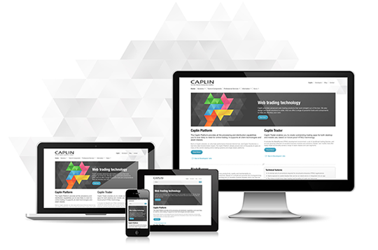
The last 5 years or so has seen the game change though. The smartphone and tablet market has exploded and though people used to settle for HTML rendering in the same formation on a smartphone as it did on a desktop, users have come to expect better delivery and experiences. This meant that the old ‘PSD to HTML’ workflow wasn’t fit for purpose anymore.

Responsive web design by its very nature means that you design for varying screen sizes and we can take a good guess at what the majority of these screen sizes will by thinking in terms of smartphone, tablet, small laptop and desktop but the actual number of pixel permutations are difficult to gauge. What we know about our users viewport resolution this month my be vary different to what we find out next month. Responsive websites should be flexible and perhaps a bit freeform – but so should the design process.
A responsive workflow
When we started the website re-design project, Caplin Systems was also in the final stages of developing new products and re-positioning our core offering. This meant that marketing literature, product specifications and documentation was also ‘in-progress’. This was a potential problem as we were designing a site with little or no content.
A classic web re-design would resemble:Brief > Create content > Wireframe > Bitmap designs > HTML/CSS markup > Deploy
But our issue was that content creation and wireframing were happening in unison and bitmap page designs would be difficult and time consuming to illustrate layouts in different viewport sizes. It became clear that our workflow had to be flexible and rapid
Wireframing and prototyping
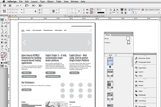
After a few sketchup sessions with the stakeholders, I opted for InDesign CS6 as my wireframing weapon of choice. It allowed me to create clickable PDF prototypes and because it has powerful ‘master page’ options, making changes to navigation and content was quite quick. This was useful as the content was going through a number of iterations, as I was prototyping. I’m not suggesting everyone should use InDesign but I found the way in which I could easily re-organise multiple pages and change top level links meant is was the right tool for me for this particular job.
Style tiles and visual design patterns
Getting sign off from stakeholders is impossible without, of course, some form of visual design. We opted to create page visual designs using existing and draft text content (knowing full well it would change) so that we could create an ‘essence’ of what the final design might look like on a desktop.
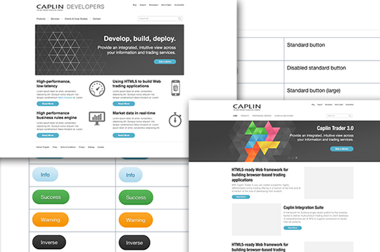
The design would focus on specific elements like typography styling, button and link styling, navigation placement and visual identity placement as well as other graphical assets like icons. This was a step deeper than creating a ‘Style Tile‘ but proved to be useful. This was enough to get approval and it meant that we could quickly move onto the next stage of the workflow.
Designing in the browser
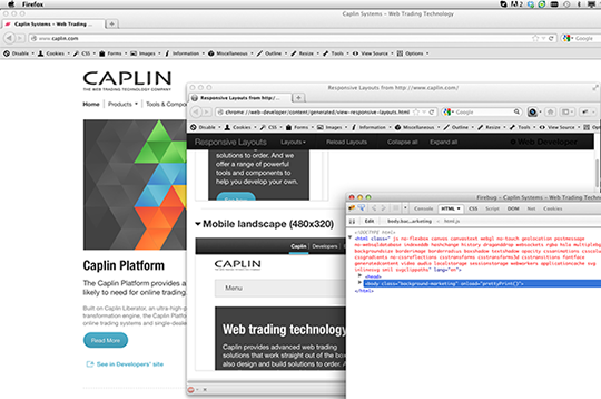
As mentioned earlier in this article, handing over multiple sizes of bitmap designs per page, to a developer, for the various screen resolutions we ‘think’ we are designing for would be a complete waste of time. Responsive websites should be (mostly) designed in the browser. Our visual designs had already defined key elements like button sizes, styles and typographical elements so this was enough information to start creating markup. A site built on a CMS (Expression Engine)is essentially designed as a series of templates so it made sense to design and build these templates whilst still waiting for final content. We had already a good idea of the architecture of our information so this made it easier to design the navigation too.
Responsive websites should be (mostly) designed in the browser.
Designing for devices
We used media query breakpoints in the CSS to alter the CSS styles based on what resolution the viewport was using. This meant that we could re-position, re-size or hide and show content for various devices. And basic example of this would be to reposition a 3 column layout on a desktop or laptop to a single column on a smartphone. Designing per device does of course go much deeper than this i.e. choosing the font size, colour, button size and position for a smartphone would differ from that of a large desktop.
A user viewing your content on a smartphone is often said to have ‘one thumb and one eye’ at his disposal. With slow connection speeds, little time and distracting surroundings, we wanted to make sure that our 320 viewport layout was mindful of this.
Device testing
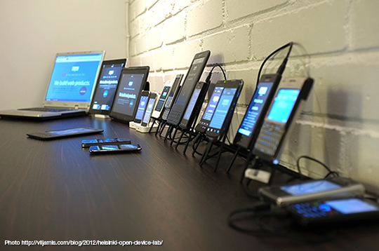
We weren’t lucky enough to have a fully stocked test lab nearby, so ended up begging and borrowing devices from colleagues in order to test. Resizing your desktop browser is fine for testing positions etc but you really have to get a ‘feel’ for swipe actions and horizontal content flows on the actual device you are designing for to fully validate your layout.
Resizing your desktop browser is fine for testing positions etc but you really have to get a ‘feel’ for swipe actions and horizontal content flows on the actual device you are designing for to fully validate your layout
Technical hurdles
Images
One of the main technical issues we faced with our responsive web design was how to correctly deliver images. There are a number of methods for implementing responsive images but we wanted to serve the correct resolution images needed for high pixel density and standard displays. Using a single hi res PNG and sizing down using percentage sizes in the CSS is fine but it means bigger files, longer downloads for displays that don’t need it.
For now we have opted to use the plugin available at http://adaptive-images.com/ which detects the users screen size and automatically creates, caches, and delivers device appropriate re-scaled versions of your web page’s embedded HTML images. We’ve noticed some intermittent problems with images not loading on iPhone 4S so are in the process of investigating this.
CMS integration
We chose Expression Engine as our content management system and on the whole it is excellent. We have however experienced issues with the code it chooses to embed videos from Vimeo. We wanted to maintain aspect ratio on the demo videos we use on pages like our BladeRunner product page but the code that EE creates prevents this.
A smartphone is not just an iPhone
There are hundreds of smartphones, all running various versions of their own in built operating systems, and with a multitude of browsers. We didn’t have the resources available to test all possible usage cases but we did test on iPhone 4 and a newish Android phone. Testing became a community affair so we relied on frequent in-house user feedback.
Design considerations
Vision
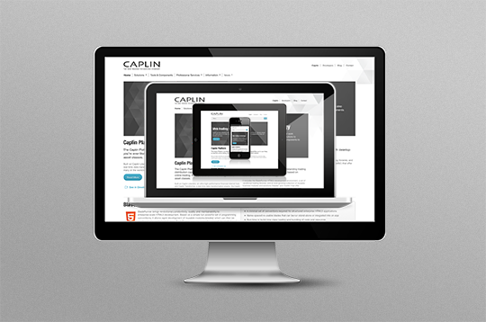
Letting go of the classic web design approach can be difficult not just for the designer but also the stakeholders who have become familiar with that process. I’ve found its counter productive to produce bitmap mockups of how the design will look on desktop, small laptop, tablet and smartphone as these mockups will inevitably be viewed on desktops or laptops and will not show the true dimensions or feel. Style tiles, design patterns and initial design mockups help but managing expectations and real markup demos on real devices are key to getting signoff.
Hi Pixel Density Displays
The creation of graphical assets for HPD displays adds time overhead. It’s better to start by creating your assets at the x2 size and then create a Photoshop action for saving down in image size. There are tools that can help a bit too.
Don’t forget touch icons
A large number of your tablet and smartphone users will be using apple devices – that’s a fact based on the number of units that have been sold. For this reason it’s important to create a specific iOS web page icon so that when user add your site to their home screen, it will look good.
The way forward
There are lots of benefits to adopting a more flexible design workflow. Each project is different so the methods and tools we used for the new caplin.com re-design may not suite your project. One thing is for sure – using Photoshop to design responsive layouts is not effective. Creating style tiles, visual design patterns, front end style guides and designing layouts inside the browser is the way forward.

Within an agency who is going to pay for the additional work at concept stage?
Hi Johan, I have the same question? Who will pay for it?
good articles.I will use these tips in my future projects. Good Luck.