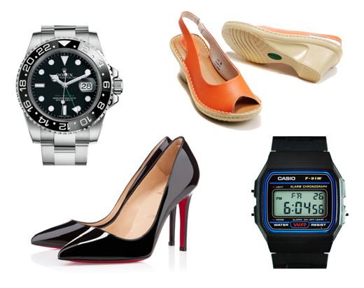
Several companies are manufacturing mobile phones and tablets with similar or even superior features to those of Apple. Why then are new Apple product releases preceded by rumours and media frenzy and followed by long queues at their stores? A plastic Casio digital watch can tell the time as accurately as a Rolex, and pair of Clarks shoes fulfils the same need as a pair of Louboutin ones. Why do we long for the lustrous timepieces and the red soles?
In his book Emotional Design, Don Norman explains that product design has several components: usability -or its absence-, aesthetics and practicality. But apart from those, he states that there is also a strong emotional component in the way products are designed and used. Quality is important, but it cannot be denied that emotions play a key role in our preference of certain products over others. In Caplin we wanted to know more about how perceptions and feelings may affect the user experience of interfaces, as we want to create products that are both useful and pleasant to use.
The test bed of our emotional research project was “Hit the Numbers”, a series of games that Caplin used in 2013 to obtain quantitative data about how key components of a user interface (such as colour, typography or movement) impact on speed and accuracy of use. The emotional research project involved an addition of three new levels to the game to obtain qualitative data about emotional responses. These levels had three very different interfaces: a minimal and sleek looking one, a corporate looking one with blue hues and a logo and a colourful one.
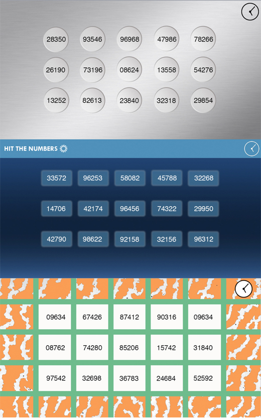
The design of these interfaces involved several brainstorming sessions and the creation of three very different mood boards for inspiration. The minimal-looking interface was influenced by the designs of Apple computers and by the functional and appealing work of the industrial designers Dieter Rams and Raymond Loewy. For the interface with blue hues, we looked at Caplin’s area of expertise, trading interfaces, but we also drew inspiration from medical equipment and aviation controls. These three domains involve a high level of skill and attention and their interfaces are similar in terms of aesthetics. The colourful interface was inspired by the eighties designs of the Memphis group, characterized by daring patterns in contrasting, bright colours.
We carried out our pilot study with twenty users from different age groups, backgrounds and genders. However, to ensure the relevance of the results, all users were numerate, digital natives and familiar with the trading domain. The task they were asked to perform was to spot an odd number for all three levels, which consisted of four screens each. The timings were recorded for each screen and level, and the user testing sessions were followed up with interviews in which the users were enquired about their impressions.
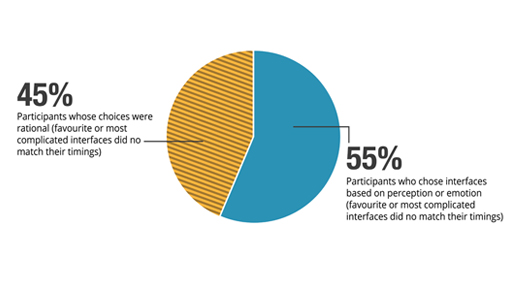
When asked to choose the interface they preferred, 40% of the users didn’t consider the designs in which they scored better: they guided their choices solely by personal preference and not by objective criteria. Up to 35% of the participants disliked the colourful interface or perceived it as more complicated than the other ones, regarded as more efficient, even when their timings were better or about the same. In total, 55% of the users chose their favourite interface or the one they considered as most complicated basing their opinion on perception or emotion: their choices did not match their timings.
This pilot study proves that the ability to perform a task in a timely manner is not the only factor that provides a good user experience. An engaging visual design is integral to any well-designed interaction, and this is no less true in web trading applications. If the interface creates the appropriate emotional response, the user is engaged in a way that makes it possible for them to work better, and in a critical interface should mean fewer errors, more efficiency and eventually more satisfied users.
That is why at Caplin we want to build software that is not only useful and reliable, but also a pleasure to use and look at.