Periodically, the whole of the engineering team have a Hack Day at Caplin. Teams of up to four have 24 Hours straight to produce something new, innovative and cool. This time we decided to produce a new way of visualising ladders for FX prices.
Team McRitlain – Richard Chamberlain, James Maclean, Marc McIntyre, Joel Ritmeyer

Real World Problems
For the Caplin Hackday VII, we decided to tackle a real-world problem exhibited in our trading tile – data density. Whilst the default trade view is somewhat compact, the ladder views prevent us from further reducing the size of our tile so that we can increase the tile count and therefore the number of visible currency pairs.
Below are screens from our current tile in both FX Sales and FX Professional.
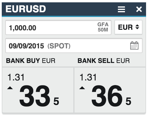
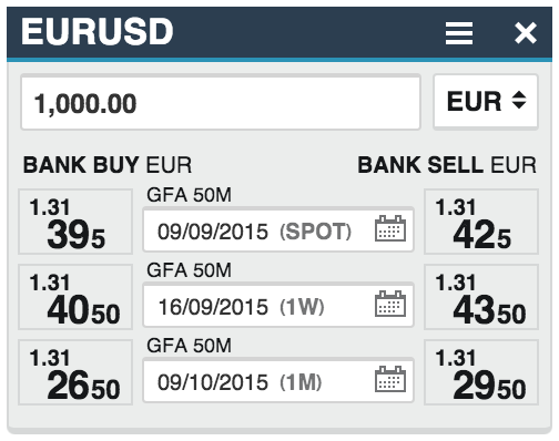
In the Sales Application, this means that we can fix 6 tiles in the trading view.
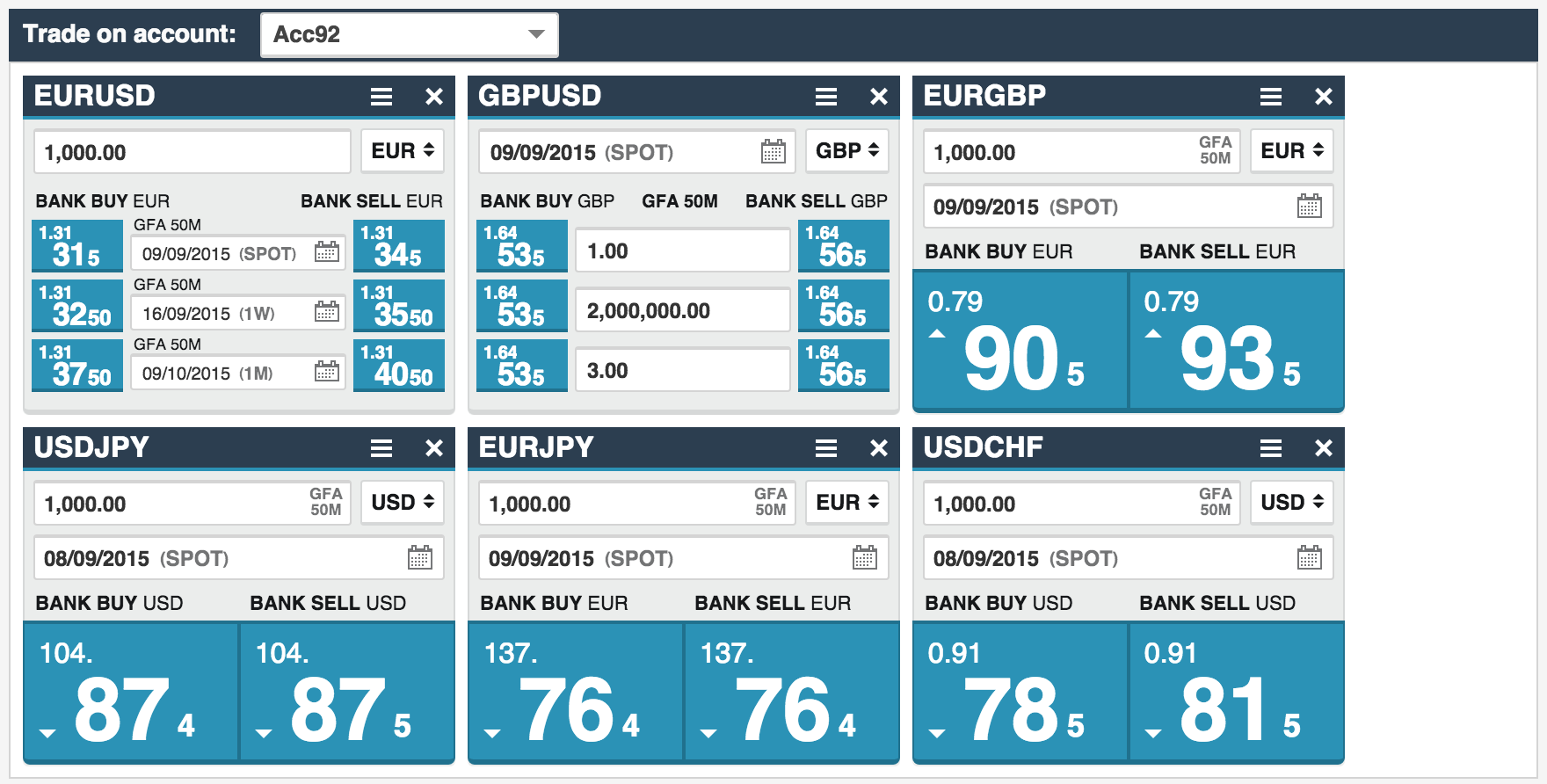
Note that this is not a specific issue with the Caplin FX tile. Showing ladder views in tiles is a common technique used amongst FX trading applications.
Design
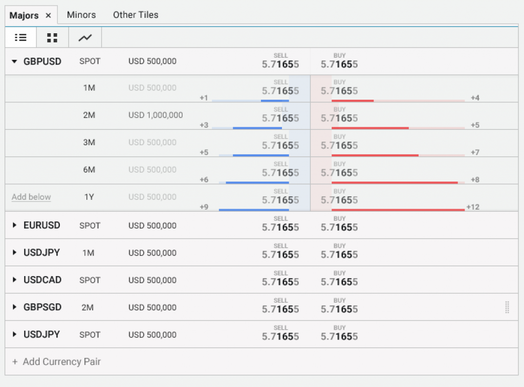
To overcome this problem, we would need to move the ladder outside the tile, but we wanted to be able to incorporate something so that tiles still could be used as they are very popular for traders. James Maclean came up with a design where a tile view which presents multiple tiles could easily be switched to another view better suited for ladders (below).
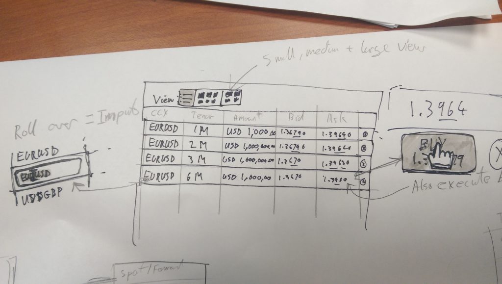
There are 3 radio switches up the top which would switch between the ladder view, condensed tile and larger tile. We dropped the idea of a larger tile as we thought it would not be necessary. Only after much discussion did the benefits of the ladder view become apparent. Our original goal of improving data density was met, but we would also get greater extensibility with a column based table in comparison to our bespoke tile component. Extra columns could be easily added for points etc, which would also mean we would not need a separate list for a swap ladder.
In essence, we wanted to capture the functionality of a tile ladder, whilst minimising the complexity and space. This meant including trading capabilities, switching tenors and amounts and currency pairs.
Joel mocked up a design in keeping with our existing applications, whilst capturing all of our requirements in this killer component. He also incorporated some visualisations for the forward curve (represented by the line blue and red bars) along with an indicator for the spread (lighter/thicker red/blue bars) which would show changes in price in relation to volume. An extra tab for charts was also added, which would show a chart view for the selected currency pairs.
Implementation – MarketLens
Hack day is a 24 hour event starting on 1pm Thursday. Many teams worked a straight 24 hours in the office! However, our team did not have the luxury of all of this time as we had to be back to tuck in young children. By “home time”, we had streaming rates into a component somewhat representative of that above, without editing functionality and styling. Once home and our respective children were sleeping, the hacking re-commenced. We had some basic editing capability, most of the styling done and some expand/collapse action by 12am.
For myself, the hacking next day began on the train, where I wrote a class to handle the points visualisation which also allowed real-time updates to points and changes to the currency pair. The editing capabilities where completed early morning, basic trading workflows followed shortly after, followed by the css transitions for the points visualisation. Some tabs to indicate that flipping between the table view and the tile view would present the tiles for the currency pairs present in the table view, and a the chart view to show charts for the same currency pairs was finally added.
We then drew a line under the functionality. That meant the volume indicator didn’t make the cut for the demo, but we include the above mockup in the presentation.
Whilst this was a proof of concept rather than technology, we did use KnockoutJS as this was familiar to use and we knew that you can be extremely productive when using it.
We had previously hooked up the component with a real-world backend system, which showed real market rates. Once we started switching between currency pairs, we quickly realised how useful the points indicator was as it updated to show the curve for that currency pair.
Demo
So how did it turn out? The following video provides a demo of the functionality.
Going Forward
We’ve highlighted that a tabular view is extremely extensible for future information, for example:
- Adding orders in the market for a currency pair
- High/Lows
- Positions
- Trade idea notifications
All in all, it was a very successful hack day for us, especially considering the time we could commit to it.