It was that time of the year again for UX designers and engineers to down tools from the usual day-to-day work items and spend 24 hours for the Caplin Hack Day.
The theme this year was ‘Simplify and Scale’. As always, the interpretation was left to all those taking part in the caffeine fuelled event.
The ideas across all teams were hugely varied, from very low-level technical implementations simplifying our core technology stack to pushing UX boundaries trying to solve very complex usability problems.
The Problem
We constantly hear from our customers- existing and prospective – about the value of understanding the end users of our applications. With this in mind, our team, Ninjatron wanted to attempt something which we don’t currently offer in the Caplin stack – true user application usage analytics. This valuable tool will help us to design better user-centred products, with an in-depth analysis of their behaviour.
This may sound a little boring but it’s actually something that we feel a lot of software doesn’t truly have a strong handle on – how people actually use applications.

It’s all about the journey
We’re aware you can go to down mining through production logs and analysing booked deals but what about the journey before we even get to that point?
How do our users get from point A to point B? Do they do so with ease? Or do they struggle to navigate the application? What other information can we gather about their or their clients’ needs and sensitivities?

There’s plenty of individuals who make a living out of analysing booked deals, but there are certainly ‘softer’ metrics for which we feel, if we had visibility, could prove extremely powerful in helping shape a far more compelling user experience.
We’re aware of other Analytics solutions out there such as Google Analytics and Piwik. However, within the constraints of the hack day, we decided it would be faster and less risky to create a simple dashboard of our own than integrating with another system. Not withstanding the security concerns for a solution such as this to be viable for any of our customers.
Log all the things!?
It’s true that one can go crazy with tracking each and every mouse click, but the data we were after was targeting specific business-value metrics for specific workflow journeys.
We focused our efforts on the FX Sales trading application, specifically the user journey of a Sales Trader quoting a price for a customer through to the point of reaching a terminal trade state (Expiry, Rejection, Successfully Executed etc). By how much (amount, percentage etc) and how often does a Sales Trader adjust the margin? How does that affect the client’s decision to execute a trade?
Focused Metrics
Rather than focusing on the visualisation of each and every click, we decided to target these specific metrics:
- meta-data associated to application actions (creating a new trading tile, launching a new trade ticket, closing a tile/ticket etc)
- modification the trade margins on an active quote
- what percentage +/- from the default margin?
- across various currency pairs
- how does a particular end user’s metrics compare to all others?
- frequency metrics associated with all the above
Thus, enter Ninjatron – your one stop shop for business-value application usage analytics.

Aims
- Capture User Actions in FX Sales (trade margins)
- Visualise the Data
- Make it shiny
Technical Overview

Front end to be analysed
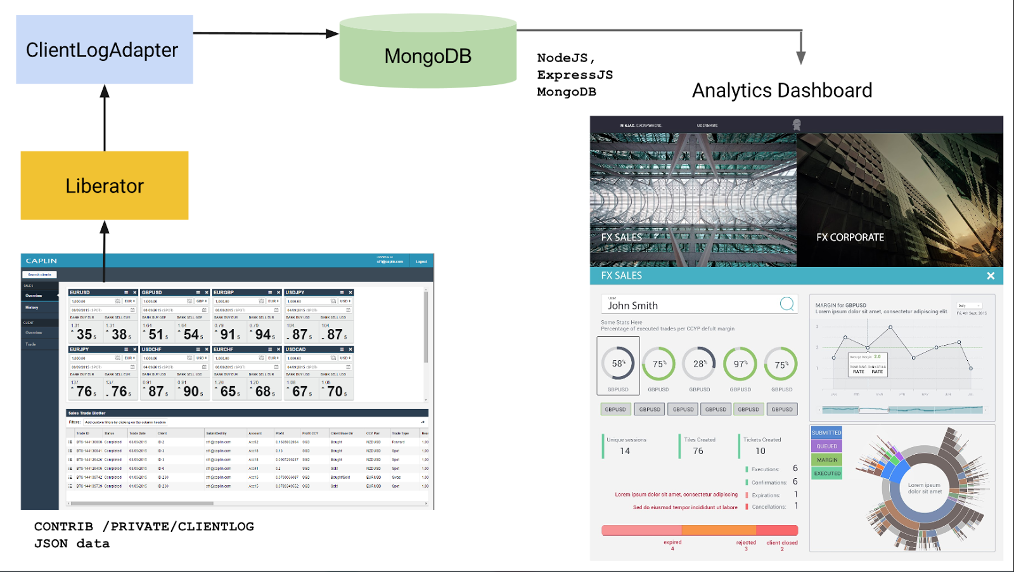
- The front end to be analysed. A service written to allow any user interaction to be logged to send data back down to the logging service on the back end. The data structure for this included: the user’s id, the session id, the component’s unique id, the action performed and any additional data involved with the action. The service should be able to be easily installed into any other existing front ends.
Client Logging Adapter
- A basic Caplin DataSource which writes the data logged by the front end into a Mongo database.
Dashboard Server
- This runs under Node.js and queries the Mongo database before parsing it into the format required for display on the dashboard. It also serves the dashboard itself.
Dashboard App
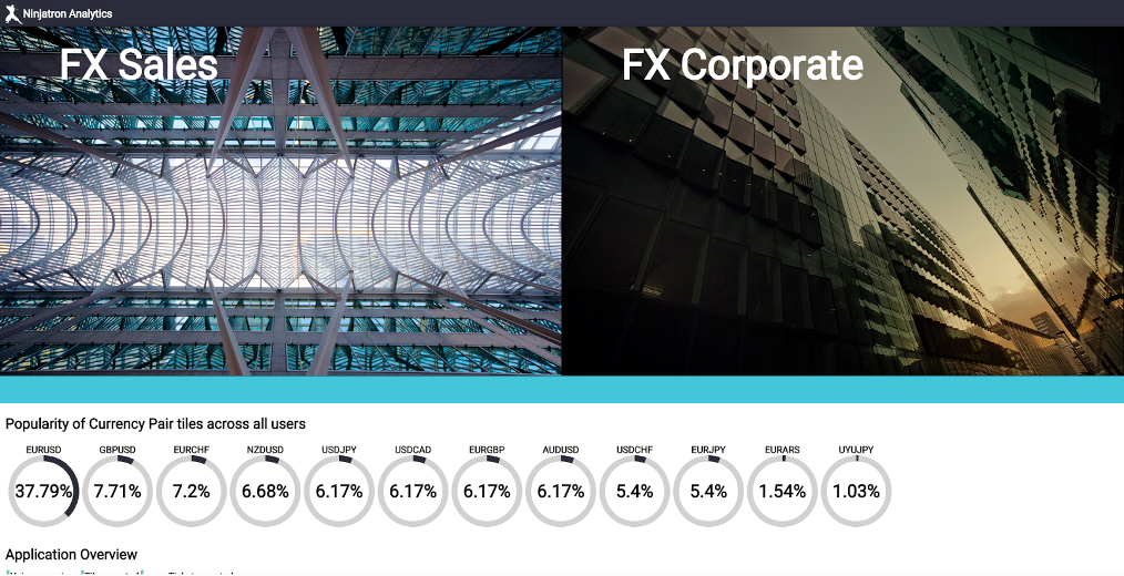
- This is a simple web app that gathers all the information churned up by the backend and graphically displays the data.
So how does the visualisation of such data help ‘simplify and scale’ for a business?
- Understanding how end-users actually interact with your application is the first step in being able improve and continue to differentiate from competitors.
- Your customers today may not necessarily be your customers tomorrow. Companies want and need this data to stay ahead.
- Having a solution to collate the information you believe to be of business important can be really powerful, especially if it comes at very little overhead.
- If you have a large end-user base, having the time to sit down and talk to a ‘representative’ set of people from that is very difficult. Even then, what they say about your application may still contradict the data from how they actually use your application!
- By knowing how people use our products, we can design them based on user’s needs and gain extremely useful information to help us plan new features and improve existing ones.
Trade State Visualiser
This chart presents what percentages of all workflows a given workflow happens.
You can see that all users go through the Submitted, Queued, Picked up and Executable states and see how this graphs into other sequential states.
E.g. 66.7% modify the default margin in the above data set.
By analysing this, we can see that a majority of trades are actually executed when the margin is changed compared to without.
We wanted to effectively display the the underlying information with high visual impact, taking complex interactions and distilling them into a meaningful representation of information which reveal the interrelation of data and how it applies our products.
We couldn’t quite fit in as many shiny graphs and charts as we would have liked, and we only scratched the surface of what would be possible.
Thankfully the Caplin judges saw the value in our idea and awarded us 1st place in the Hack Day 🙂
The Team
Vinh Lam, Priyank Vyas, Ross Anderson and Giulia Fortuna

Cool interactive graphic!