On November15-16th, several members of Caplin’s QA team attended the Selenium Conference, an annual conference about Selenium Testing tool and best practices.
As someone who is relatively new to Selenium but has been Dev-ing for about 3 years, I was really impressed with the wide range of topics covered, from the basics of Selenium to best practices and how to tackle problems. See the full list here.
We loved hearing all the talks and I am about to share my views on the talk about …
Big Data makes the flake go away
Dave Cadwallader (@geek_dave) the speaker and creator of TestArmada delivered a good talk with examples on parallel testing and how to use data visualisation and statistics to help us tackle flakiness in tests.
He started talking about something that I have heard quite a lot in my career when it comes to CI testing, the famous “your test is flaky or this test is flaky”. Everytime we run our pipeline we Hope that it passes this time, as Dave mentioned in the talk, Hope is not a strategy, we have to acknowledge that flake exists and we need to find where exactly, and when we find it we can measure it, and when we measure it we can control it.
There are 2 types of flakiness:
- Pass/fail flake: Sometimes it passes, sometimes it fails, who knows why.
- Performance flake: The test passes but sometimes it takes really long time to finish but sometimes it finishes quickly.
Why is flake such a pain?
Because it is non-deterministic
… given the same input exhibits different behaviours on different runs
High Concurrency
Dave shared his experience on how he and his team handled flake tests. It wasn’t easy and didn’t happen automatically. They started with a bright idea that high concurrency will make test suites fast so developers won’t wait a long time till they know that their code is safe.
The premise of high concurrency is delivering several tests at the same time so we can have fast results.
The picture below show the best case scenario. Where 3 tests are running in parallel. Source [http://2016.seleniumconf.co.uk/

The picture below shows the real case scenario when we have flaky tests. The area which looks like a melted candle is the area where we re ran the tests called the “Retry Tail”. Source [http://2016.seleniumconf.co.uk/].
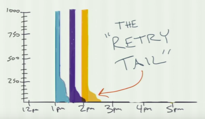
Retry tail
… Extra rounds of testing tacked onto the end of a test suite when one or more failing tests are retried.
Their dream of high concurrency was weakened by test flake. So he co created Magellan by TestArmada, the tool that helps to orchestrate high amounts of concurrency. This tool has two main features: one is spawn a big number child processes in your test library that give parallelism, the second one adds false tolerance (smoothing over a test flake by retrying them). Magellan helped to reduce the flakiness but not to 0%.
As there is no such tool that will fix the entire problem, He introduces us to Bloop by TestArmada. Bloop takes each child processes from Magellan and add them to a reporter that sends UDP packages to the backend InfluxDB database with the time that each test take to finish.
The downside of this process is the use of the UDP protocol, the speaker joked:
I won’t tell you this joke because you may not get it.
Data Visualisation
InfluxDB stores the information for each test run, there is a good amount of important data that can be shown graphically. Here is when Big Data came to the rescue with the name of Grafana data reports, this tool will show the following measuring graphs.
- Flake Rate: Tests that eventually passed after requiring one or two retries.
- Suite runtime: Total duration of all tests in a suite.
- Individual test time
One important technique in Visualization is Slicing. If you imagine that test flake is like a bruised apple and we don’t know which parts are safe to eat, we can slice the apple to separate the good parts from the bad. So we can use statistics and Data Visualization to slice our data in the same way, looking to separate what is flaky to what is not. This will give us a much greater idea where we can start to look into.
But when we just look into the lines visually, is difficult to interpret the meaning, so we need some statistics to help us out.
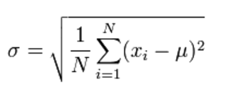
Statistics: Standard Deviation
… a measure of how spread outnumbers are
http://www.mathsisfun.com/data/standard-deviation.html
Standard deviation is a number used to tell how measurements for a group are spread out from the average, or expected value. A low standard deviation means that most of the numbers are very close to the average. A high standard deviation means that the numbers are spread out, source.
InfluxDb times series data storage, happens to have a button to get the Standard Deviation for each test. Tests with high standard deviation will be shown in red and it will give us a green light to start looking into it for flakiness.
Currently we are relying too much on if a test has failed/passed. Leaving away reports or past history for failing tests. History can help us take better decisions and act promptly when a test fails. As highlighted in this talk, visualizing data will give us a better view on where to start.
In summary, I learnt so much from this talk and from the conference itself and enjoyed the chance to chat with others about testing technologies.
Flakiness will forever be a topic in test conferences, the solution always seems to be tools and more tools. This talk stood out as its research was based in statistics and data visualization. This may not be the solution to flakiness but Standard Deviation and Visualization will improve the way we can control it.