As a User Experience Designer at Caplin Systems, I am faced with the challenge of translating complex financial data into something quite lively and exciting on a daily basis. With that in mind, I recently had the pleasure of watching a TEDtalk entitled ‘The Beauty of Data Visualisation’ by David McCandless, a data journalist, information designer and author of ‘Information is Beautiful’.

The overriding message I got from watching this video was that we are living in an era of information overload. Information is omnipresent and is being thrown at us incessantly. We absorb the world around us primarily visually; the eye unconsciously taking in information all the time, which can prove to be quite overwhelming (particularly in the financial sector, where information is constant and paramount).
One particular issue we face when looking at information is the matter of isolated data (data displayed on its own), as data should be visually relative to be best understood. As an example, if we look at America’s large annual military budget and compare that to other nations’, we may think the US is a war-mongering nation. However, David points out that if you compare this to which nation has the biggest budget in relationship to their GDP, you see that America ranks 8th in military spending. Hence, data is largely meaningless without context.
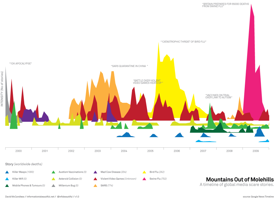
Above is a famous example of one of David’s infographics, here depicting a time line of various global media scares. While visually stunning, the level of accuracy and ability required to compare the data is lost when translated to the 3D plane he uses. In regards to our requirements when designing financial applications, we must demonstrate highly accurate and information-rich data and then consider ways to make this data beautiful.
David goes on to offer the solution of visual ‘information maps’ that can be explored with our eyes; landscapes where hidden patterns emerge naturally. These are especially beneficial within the financial sector, where traders are faced with noticing patterns in prices rising and falling to best decide when to buy/sell equities. By treating information as a story or landscape, we can communicate in the language of the eye: one that picks up on shapes, positions, colours and variations. Relationships, patterns and connections will then appear from the data and be intuitively understood by the individual.
Furthermore, as our eyes are encumbered with a saturation of data, it becomes crucial to relieve them through the use of visuals:
“If you are navigating a dense information jungle and you come across a beautiful graphic or a lovely data visualisation, it’s like a relief. It’s like coming across a clearing in the jungle.”
It is for this reason that as User Experience Designers at Caplin, we must consider how to inform without overwhelming our users. With the inclusion of information graphics and data visualisations over linear data grids, we can delight those who use Caplin Trader. This is key to creating an enjoyable and valuable user experience, and at the end of the day that’s our job.