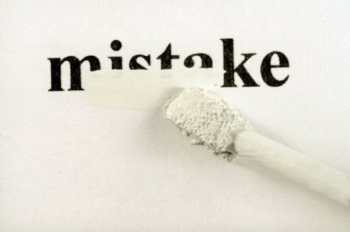
Hello again and welcome back to the Psychology of UX series! Today’s topic is all about MISTAKES. But before we begin let’s just define…
What exactly is a mistake?
“..a decision or action, or lack thereof, that we fear we’ll come to regret. They usually cause some degree of pain, loss or struggle,” says Mel Schwartz from Psychology of Today. For a more software-based explanation we might say a mistake is simply something that is wrong or that causes a problem with a user’s normal workflow.
Yes, mistakes. We all make them. We wish we hadn’t. One snooze button too many. Spending money on things we shouldn’t. Having that extra cocktail at work drinks and breaking out your embarrassing dance moves….I’m divulging too much of my personal life. But what about mistakes in the digital world? What happens when a user makes a mistake on a computer? These are things we will cover in today’s post.
‘Assume people will make mistakes. Anticipate what they will be and try to prevent them.’
Susan Weinschenk stated the above in her ‘Psychologist’s View of UX‘ post, the inspiration for this series.
Why would we want to prevent them though?
Well aside from mistakes causing users great frustration and pain when interacting with a system, mistakes can be rather costly, particularly in the financial sector where a user might be trading thousands, or even millions, of dollars with one click. It’s imperative when designing the user experience for financial interfaces to make the workflow easy-to-use and error-free.

So how do we prevent errors?
The best error message is no error message. What this means is that a system that is designed well will not allow the user to make an error to begin with. The main way we can accomplish this is by predicting what mistakes a user might make, based on knowledge gathered by researching the environment they operate in and their needs with the system. We can then adapt our designs accordingly to avoid allowing those mistakes to be made in the system.
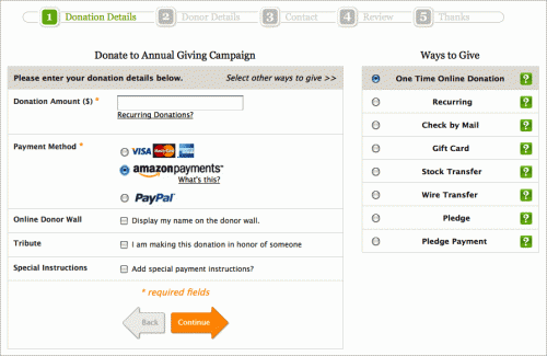
If the task the user will be conducting is very complex or error-prone, a further approach is to break up the task into smaller steps so that each step can act as a quality gate before the user is allowed to move onto the next. We often see this design solution in online payment portals on retail websites, like Amazon or this donation website below.
How do we treat errors in the system?

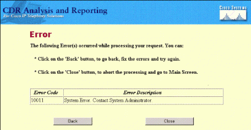

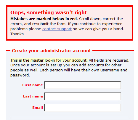
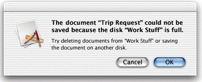
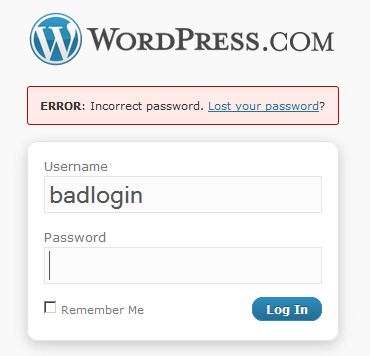
Not like this. Can you read that? Honestly? Even you developers out there (who often are the ones who have the mission of writing these error messages). You are human too — we don’t talk like that. The first crucial step to dealing with errors in a system is speak in human language! Explain that an error has occurred, what the error is, how the user can correct it and where they can go for more help to fix it. In plain language. When something goes wrong in a system, it’s of the highest importance that the user knows what to do about it.
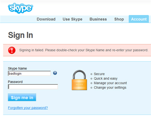
The below images are great examples of clear, human language communicating to the user the problem with visual cues (symbols and colours) and sometimes even contextual hints as to where the problem went wrong (i.e. a highlighted password field when the password is wrong)

We should also allow users to UNDO actions, such as mistakes they have just made. Ctrl-Z, anyone? It’s been a godsend for me. Users need autonomy within a system and this can only be achieved if the system is so well designed that the user can’t get so lost down a path they can’t find their way back to where they were. Allow them to undo and reverse steps. Similarly the ‘ESC’ key can be used to exit a curtain task that isn’t yet completed, to prevent the damage from being done.

In reality, it is near impossible to create a completely error-free system that guarantees the users won’t make mistakes. But why?
Because people make mistakes and UX Designers are just people.
“If Ernest Hemingway, James Mitchener, Neil Simon, Frank Lloyd Wright and Pablo Picasso could not get it right the first time, what makes you think that you will?”
Paul Heckel
Without sturdy user research, the designer will have a lack of knowledge of the user needs and this can result in an unusable design. That’s why we as designers need more time. More time for research with the users and more time for testing with the users.

At a ‘Lean UX’ workshop I went to last weekend Janice Fraser, one of the founders of the famous Adaptive Path UX consultancy, said rather powerfully in regards to the Agile methodology, “Don’t throw the design out into the world and hope it works. I no longer want that responsibility. We are supposed to get it right the first time, yet the developers get to do it over and over again.”
UX Designers need the allowance of time and budget to be able to test our prototypes on real users before the designs are fully coded and completed for product release. That’s not to say that a design shouldn’t be coded to test if it’s implementable or to test the functioning prototype on a user, but we need time to test the designs before they are finalised.
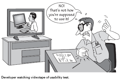
That way we can see what errors the user might run into or what errors are prevalent in your design. And then we can iterate and improve on our designs.
Not enough time?
“The joy of an early release lasts but a moment. The frustration of an unusable system lasts forever.”
Let’s do it right, step by step, and try to design a system that is mostly error-free.
Thanks for reading! The next part of the Psych of UX series will be on how human memory is complicated. Until then…

The example that always sticks in my mind about mistakes is when “pilot error” is blamed for accidents.
For non critical products though, does the design always really need to be right first time? Is it better for the user to have the new product sooner even with a few foibles rather than wait and then iterate once it’s live.
I guess it’s a balancing act. Software could always be improved there’s always a cut off point.